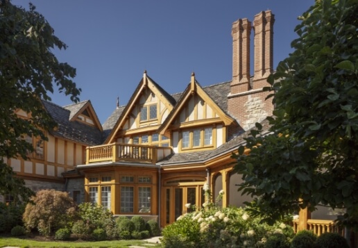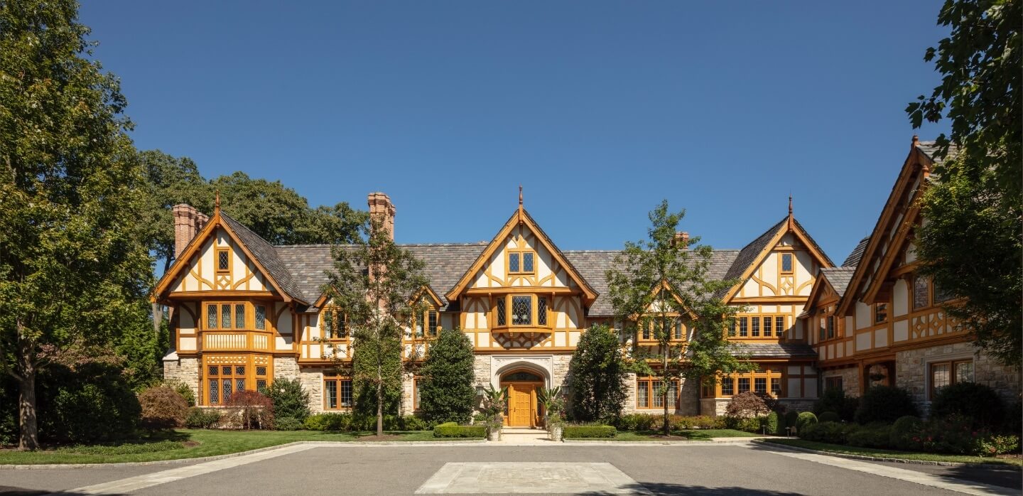
Inspired by the great Tudor manors of late-sixteenth-century England, this great stucco and stone house feels very much at home in the old estate section of Greenwich. Given its extensive program and size, the question of scale was critical to the design’s success. Every house, no matter its magnitude, acts as a diplomat between its occupants and the world outside. For this house, the adjustments to proportion at every level—from a distance, upon approach, close-up, and to the touch—were vital in bringing its massing down to a human size. Outside, the spaces next to the house were treated like rooms to extend that scale to the outdoors, creating a comfortable and livable landscape. Each part of the ensemble that was created by the house and its attendant guest cottage and pool pavilion was carefully considered to relate both to the owners and their surroundings.
Gallery
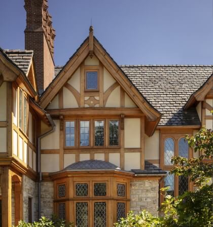
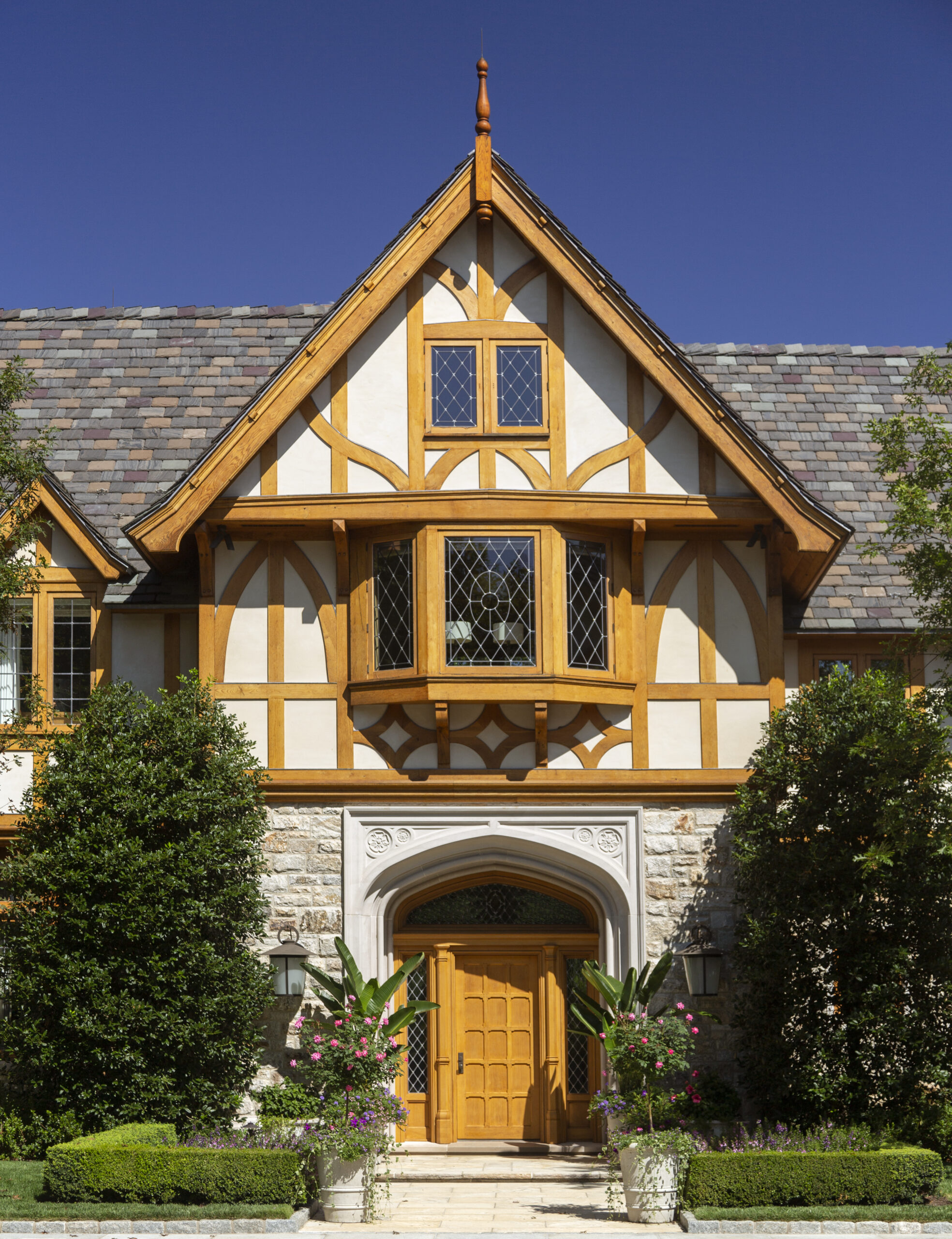
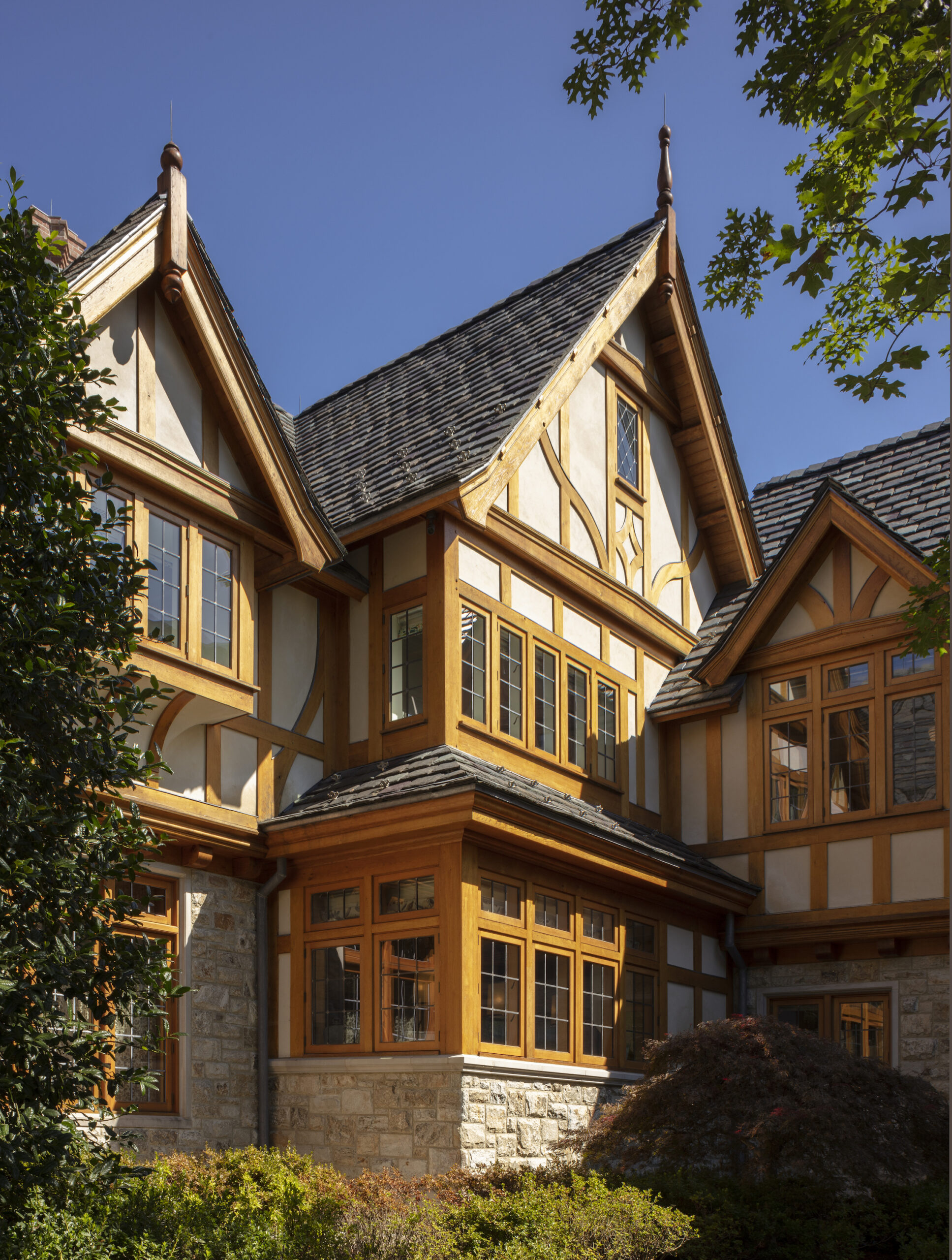
Composed of several gables, the asymmetrical south-facing entrance façade is anchored by the front entrance embellished with a carved limestone surround. The gables, each with an identical pitch, are carried out using a similar palette of details but with subtle variations that give each portion of the house a different personality. The stone first floor creates a weighty base to the stucco-and-timbered second floor that, in some sections, slightly overhangs. In other portions, dormers peek out of the slate roof, a device used to minimize the impact of the house. Drawn from the vocabulary of the Tudor style, cantilevered gables carried by brackets, barge rafters, curved timber braces, bay and box windows, and leaded glass windows are seamlessly incorporated into the design and scaled to bring the entire assembly down to an intimate human level. Each section is warm and approachable with an abundance of small-scale details. On the north façade, the bay of the dining room is clad with soft gray lead-coated copper in a fish-scale pattern.
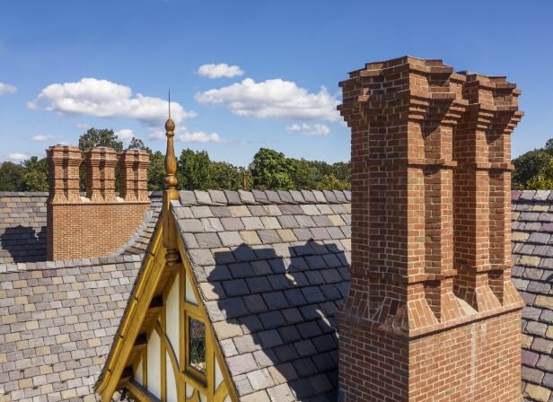
To the north, the door into the entrance hall, which extends through the depth of the house, is embellished with octagonal wood colonnettes. Meanwhile, the more formal front door is accentuated by limestone colonnettes. All of the windows are of leaded glass and set in oak frames. The honey-stained white oak and the brown and golden hues of the stone ashlar lend a warmth while giving the home a sense of age and history. The horizontal bands on the façade are not perfectly aligned and the slightly awkward collision between the kitchen gable and adjacent mudroom wing creates the illusion that the house was built over time. Also utilized by early twentieth-century American architects working in revival styles, these tactics were used to fabricate a patina of age and generate history. In the spirit of the Tudor, the substantial soaring chimneys pin the sprawling composition to the landscape.
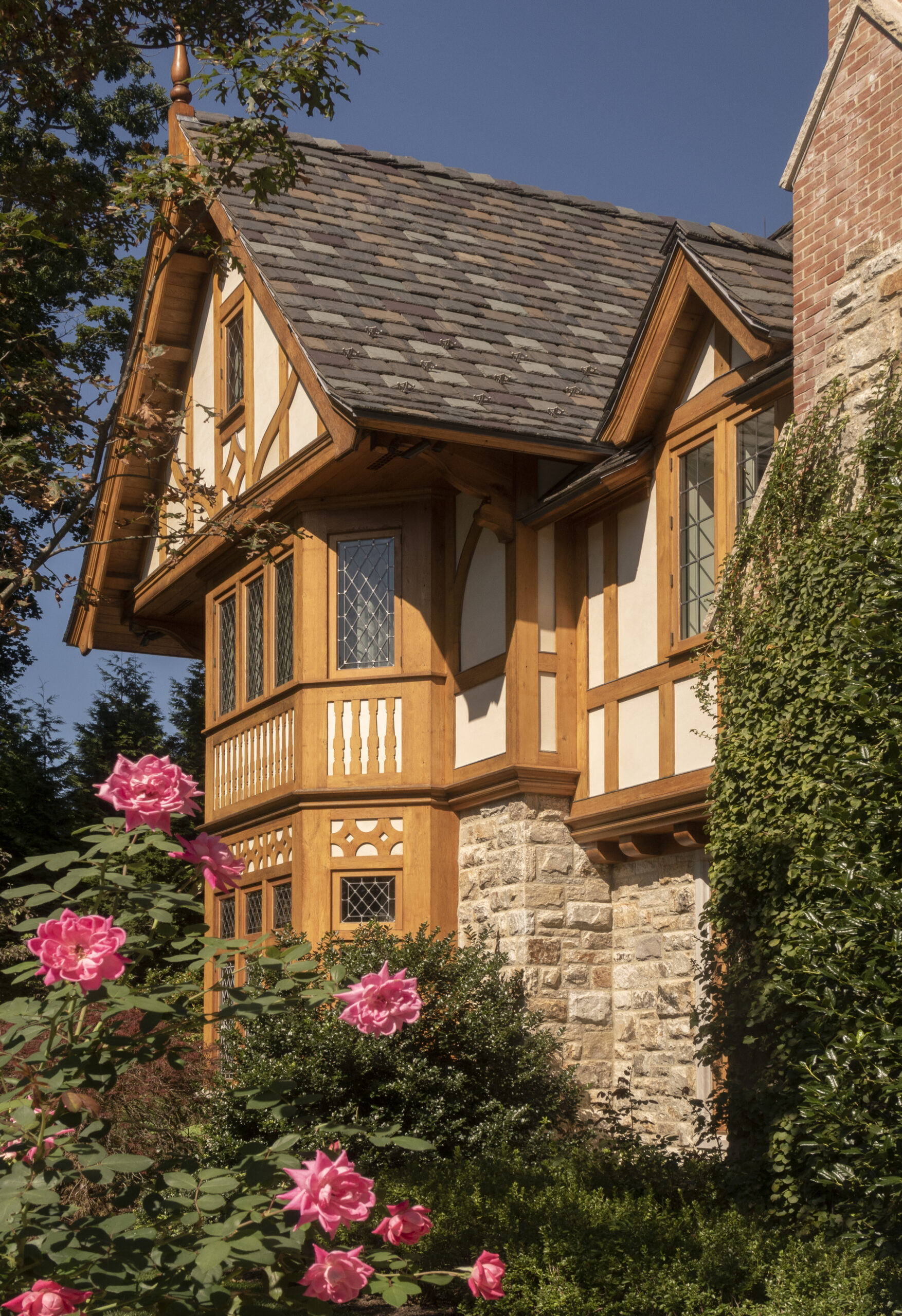
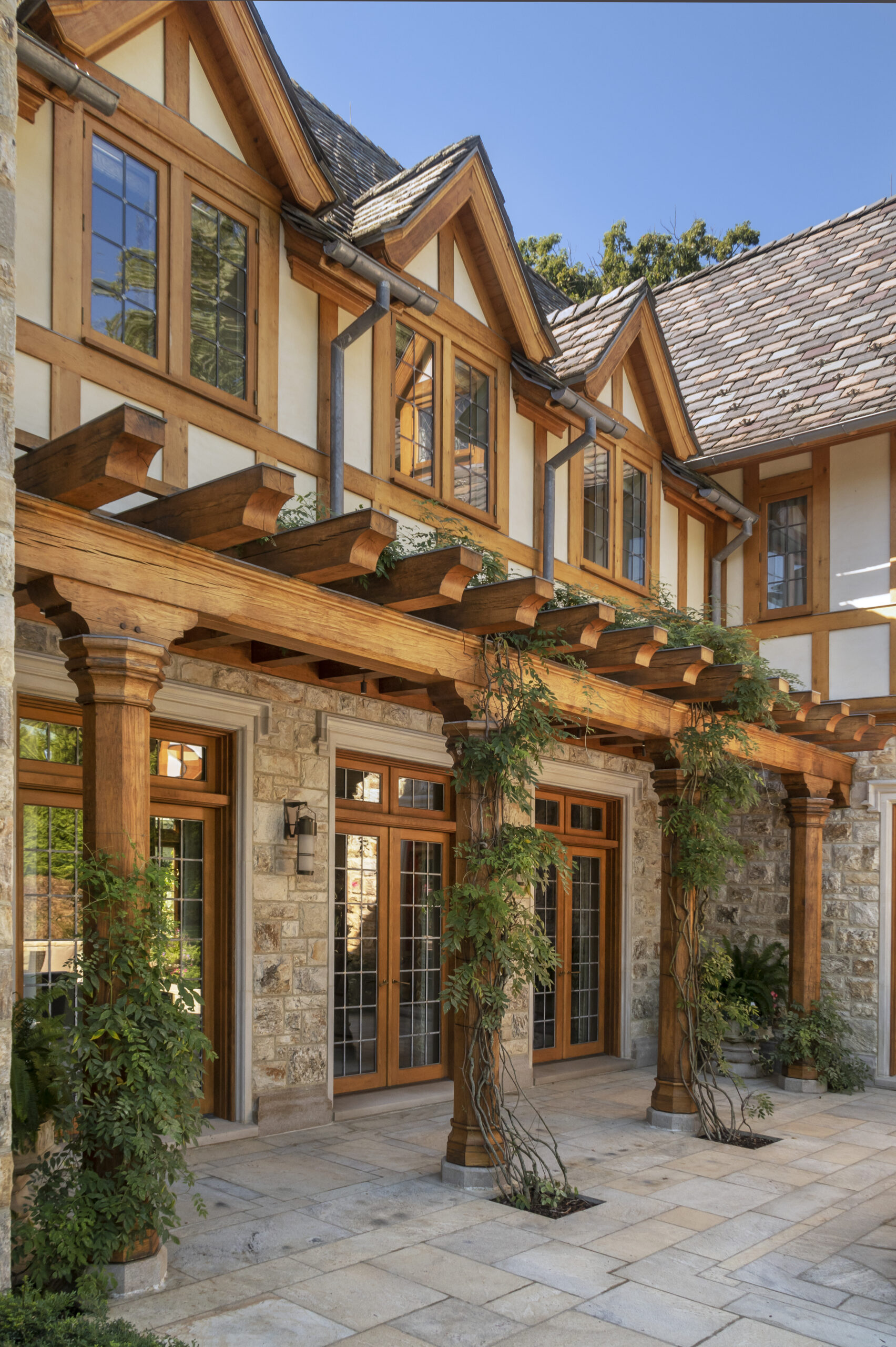
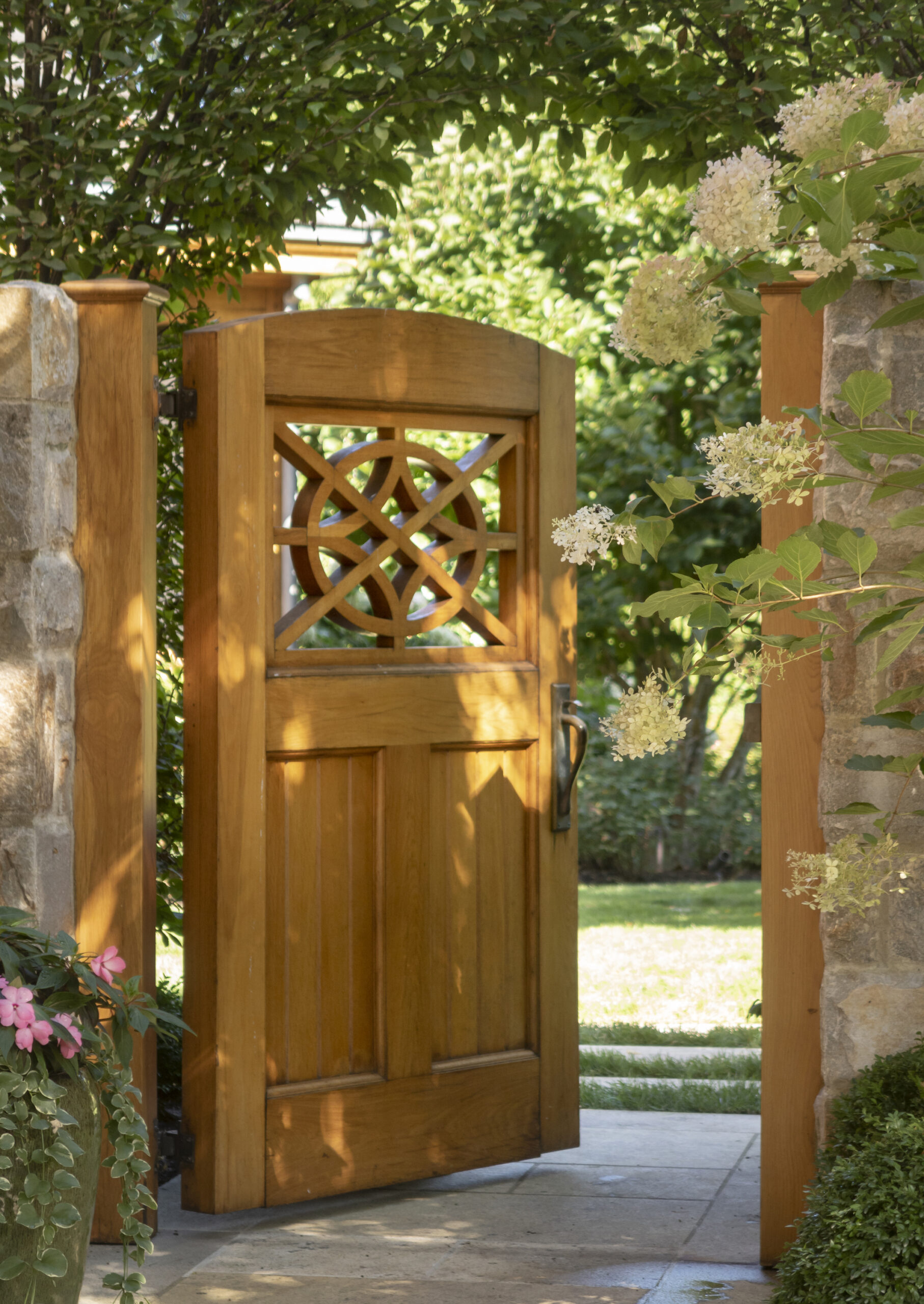
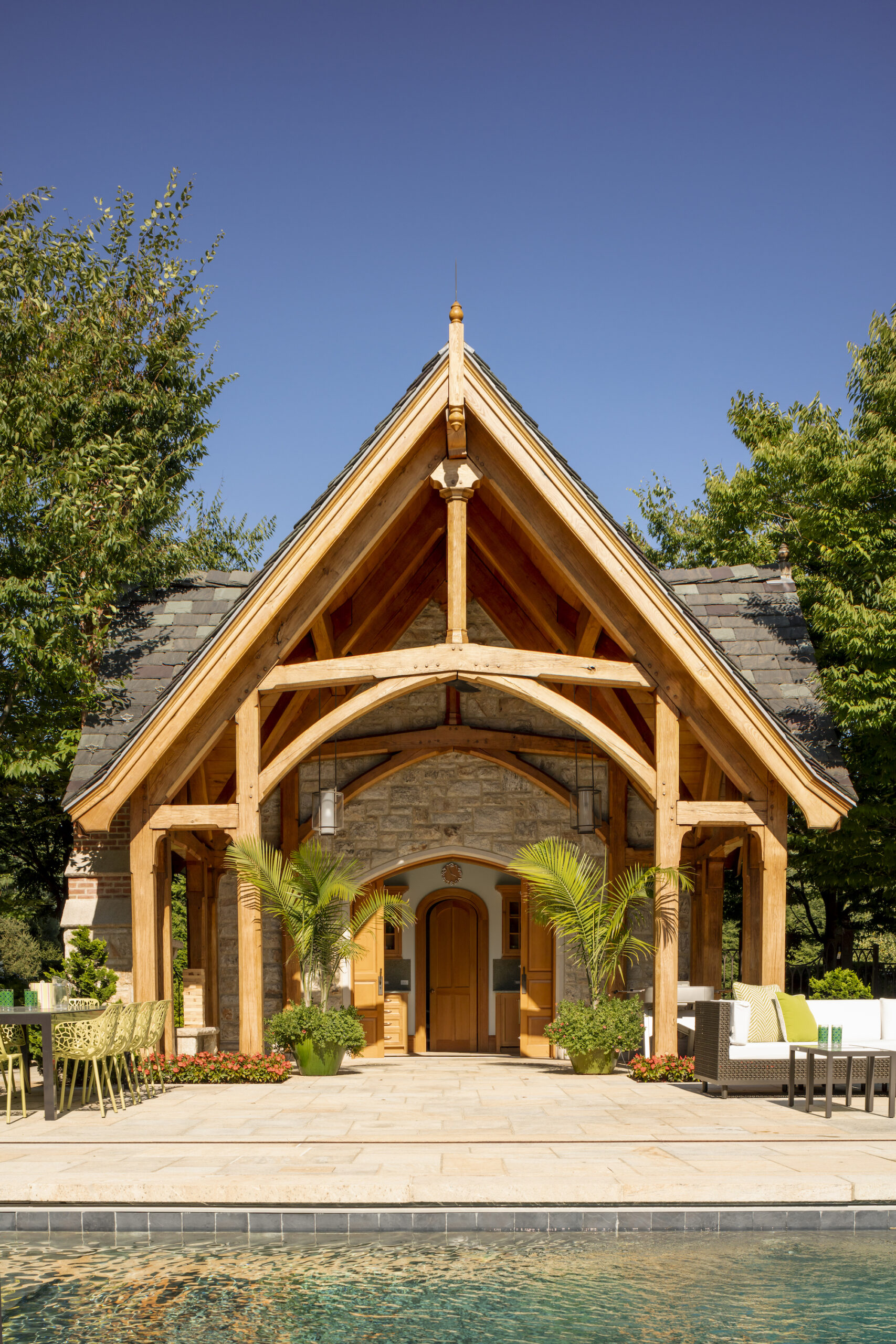
Outside, room-like spaces interrelate to the scale of the interiors. To the west, a small garden extends off the porch of the billiards room. The family and breakfast rooms embrace a small side yard to the east. The public rooms—the entrance hall, billiards, living, and dining rooms—overlook a broad terrace that leads to the flat northern lawn. Situated to the east of the property, the picturesque stone guesthouse and timberframed pool pavilion, together with a pool and tennis court, are organized to create intimate outdoor areas. With this commission, Wadia Associates sought to make real spaces detailed and scaled for its occupants, using materials and imagery in a meaningful and enduring way.

