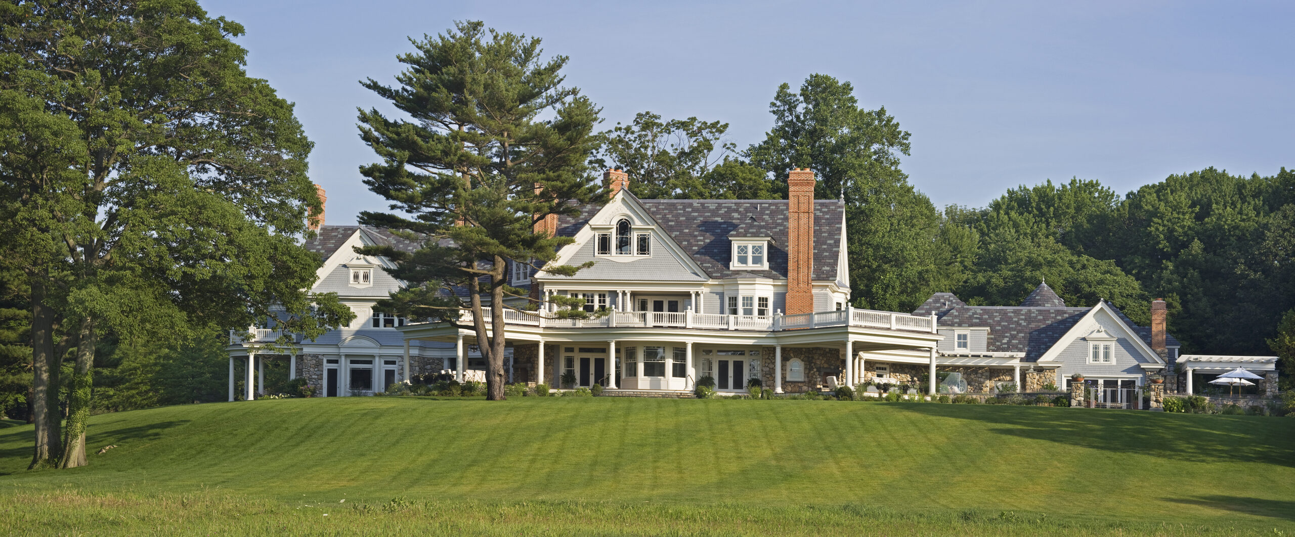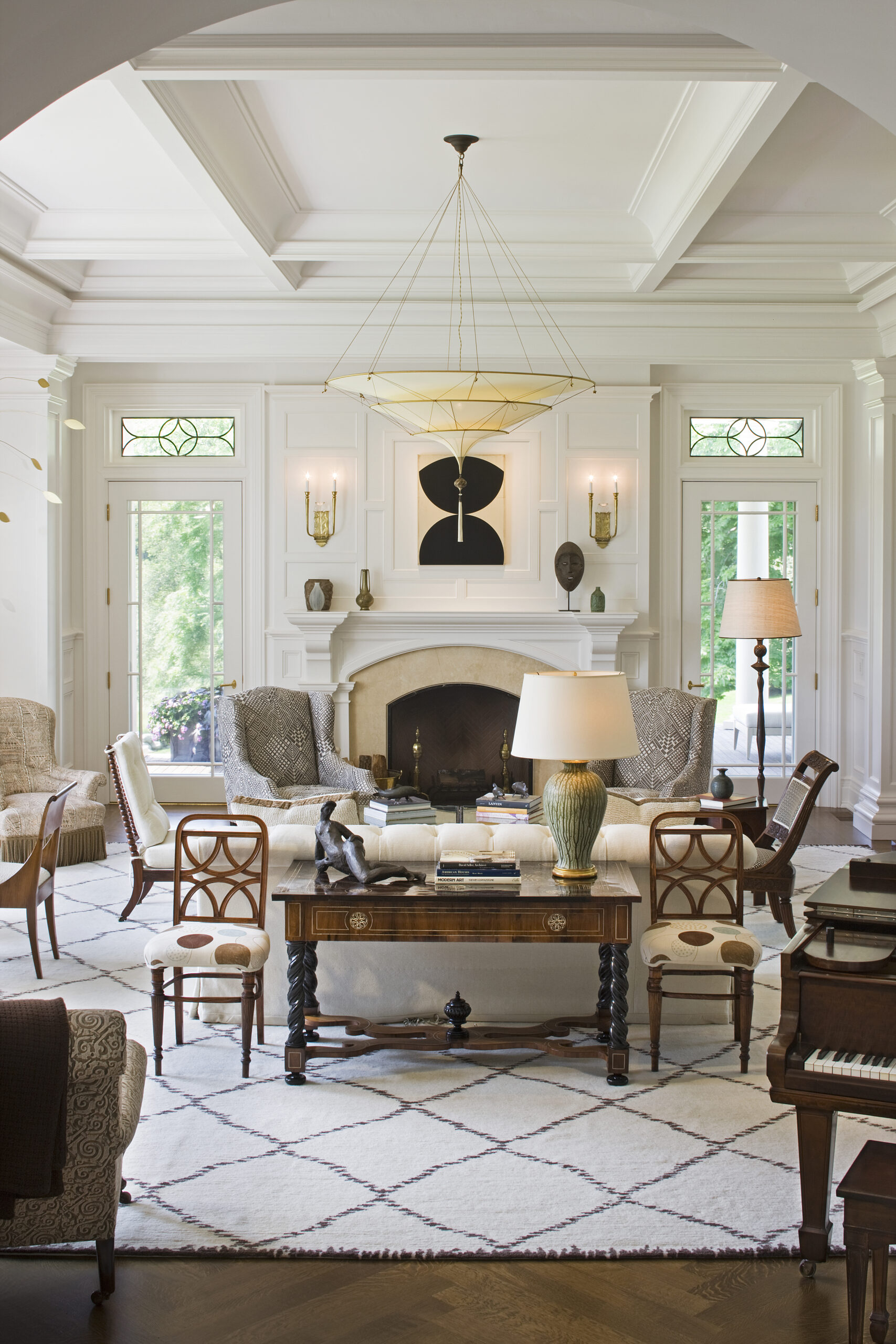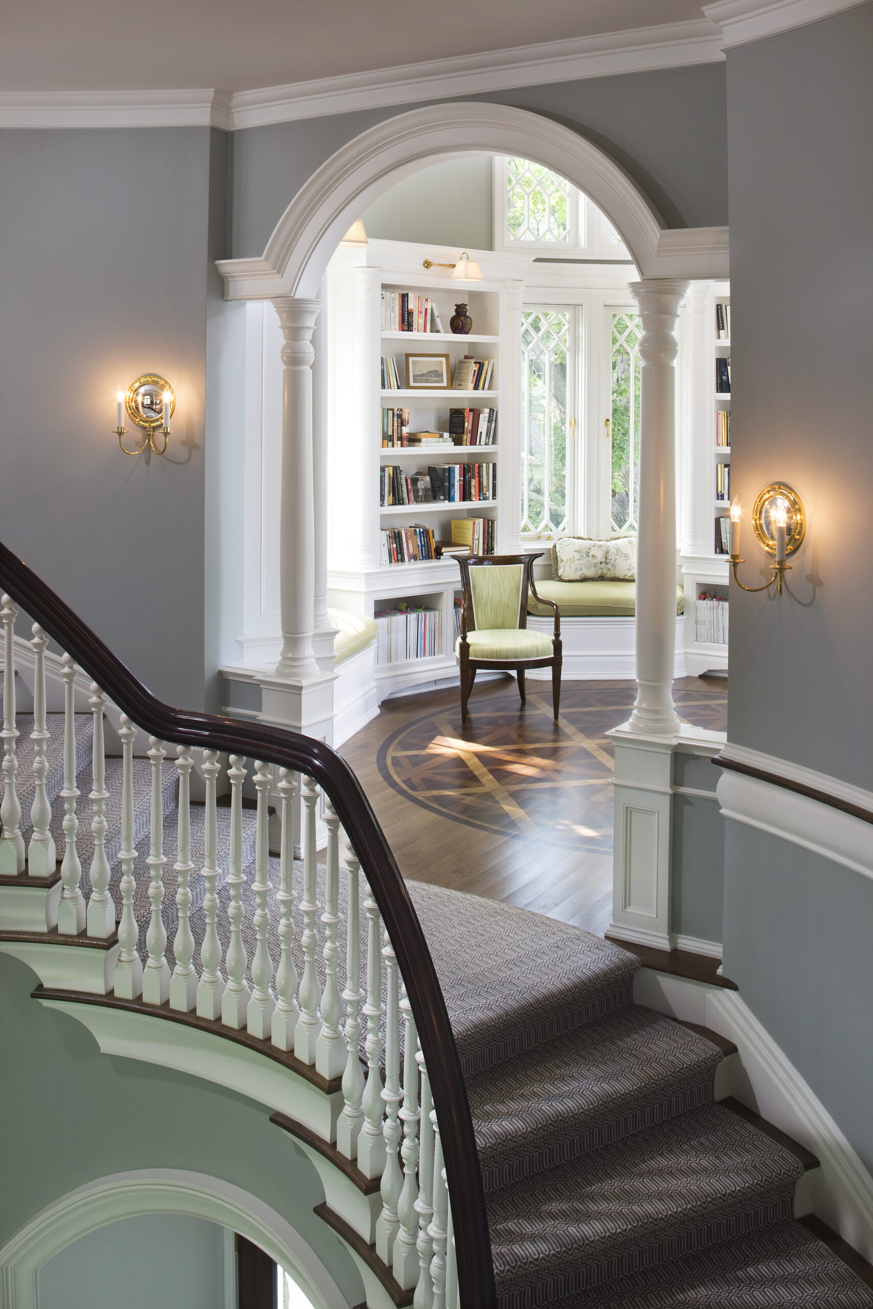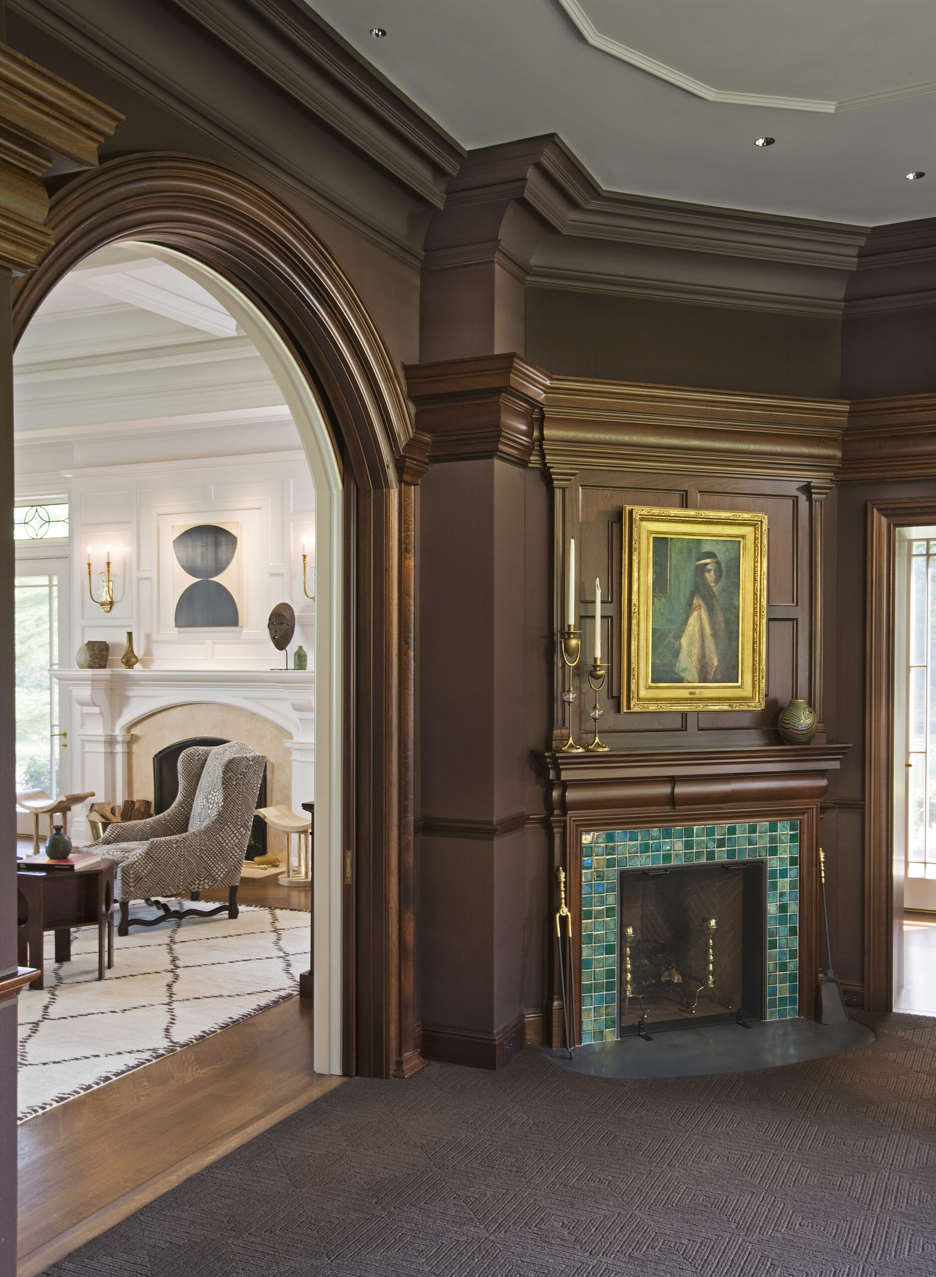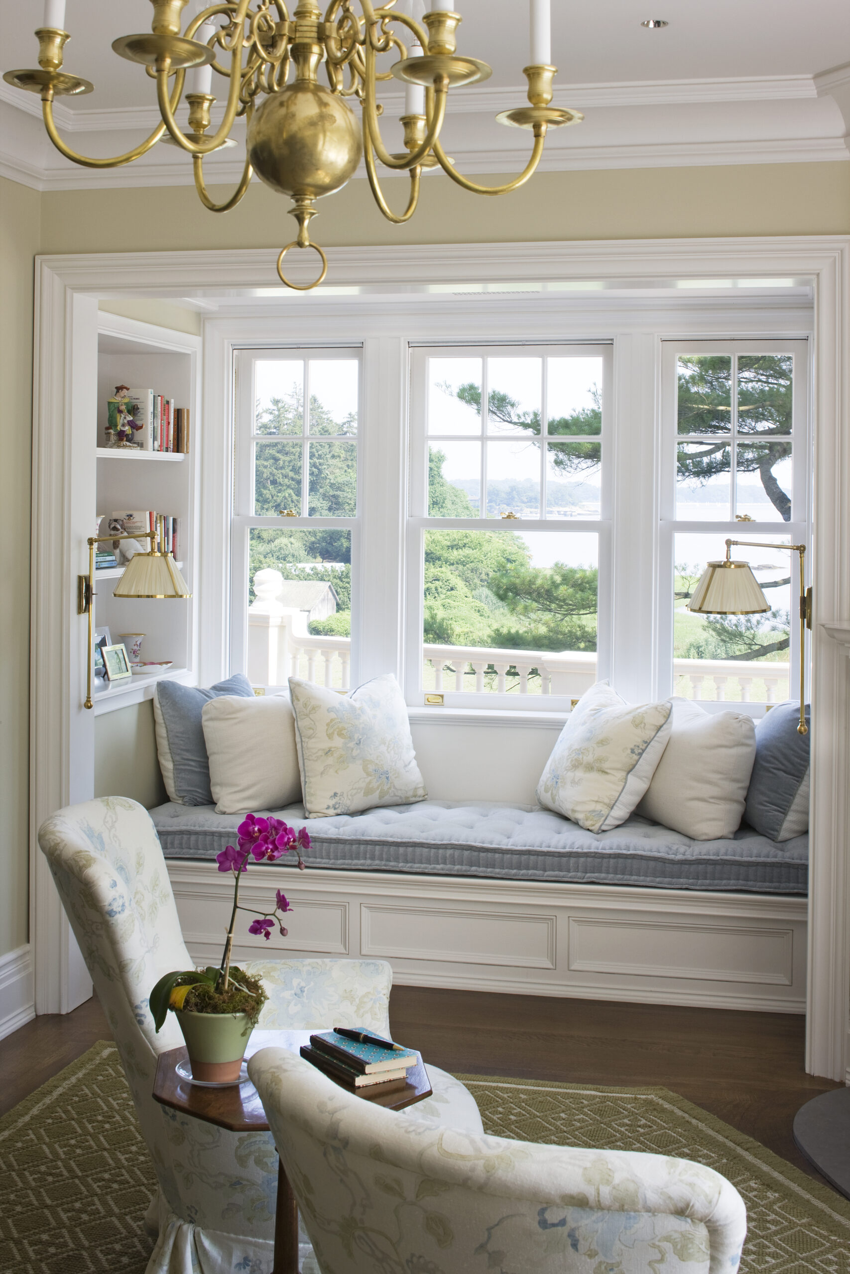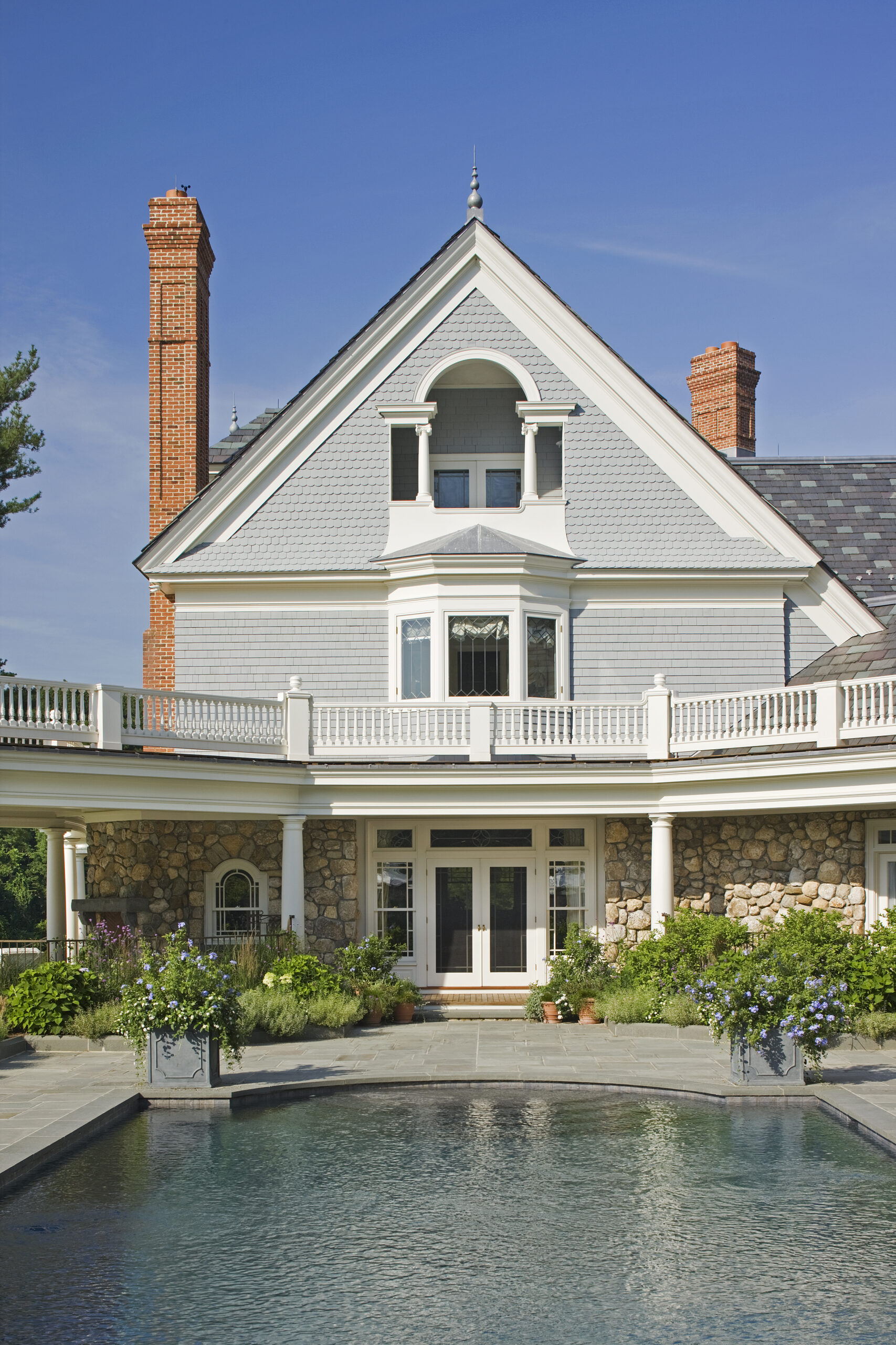
The clients of this new Queen Anne–style house came to Wadia’s office with an idea of what they wanted for their unique boomerang-shaped property on Long Island Sound. They were taken with the Wadia house pictured on the front of the office’s first monograph; however, their land with views of the water and tall trees that needed to be preserved was much more complicated. Because of the sight lines, it made sense to place the house at the bend of the boomerang, but that required the plan to stretch in different directions to maximize the site. From the earlier design, the clients were drawn by the rounded porch at the end of the house and the tower above the entry which contained a reading nook.Working in the same Queen Anne vein, Wadia Associates incorporated these elements but tailored the design and plan to fit the exigencies of the oddly shaped site.
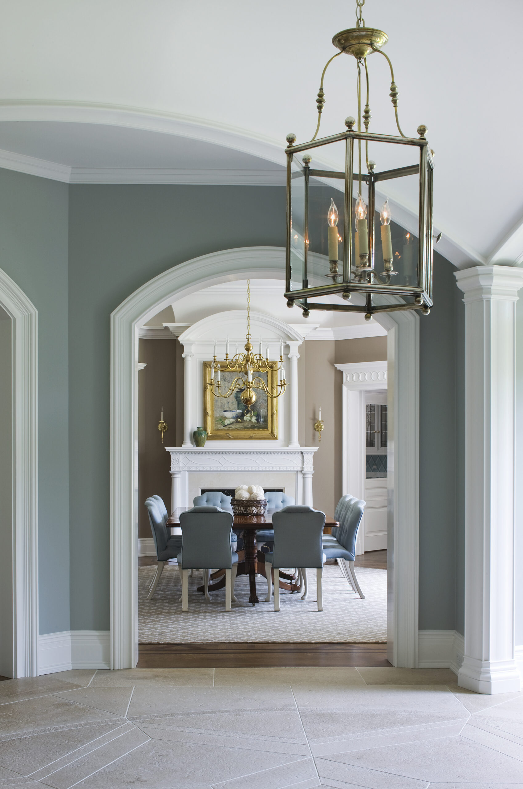
The exuberant Queen Anne style provided the perfect façade to contain the energy of the resulting angled plan. Because the house had to look both ways—to the front of the property and then shift one hundred and thirty-five degrees toward the water—the design required a number of calculated angles. Picturesque and asymmetrical, the elegant and playful nineteenth-century American style could easily absorb the flow of this plan and make it appear organic and unintentional—an enchanting quality of many historic Queen Anne houses. In a move that might seem counterintuitive, Wadia then looked to the French architects working during the eighteenth century, such as Germain Boffrand and Claude-Nicolas Ledoux, for plan inspiration. These architects sought creative ways to fit symmetrical house plans into the ancient and irregularly shaped lots of Paris with precise resolution. In this house, the main square entrance hall with a saucer dome supported by shallow arches serves as the spring point for the forty-five-degree angle shift in plan.
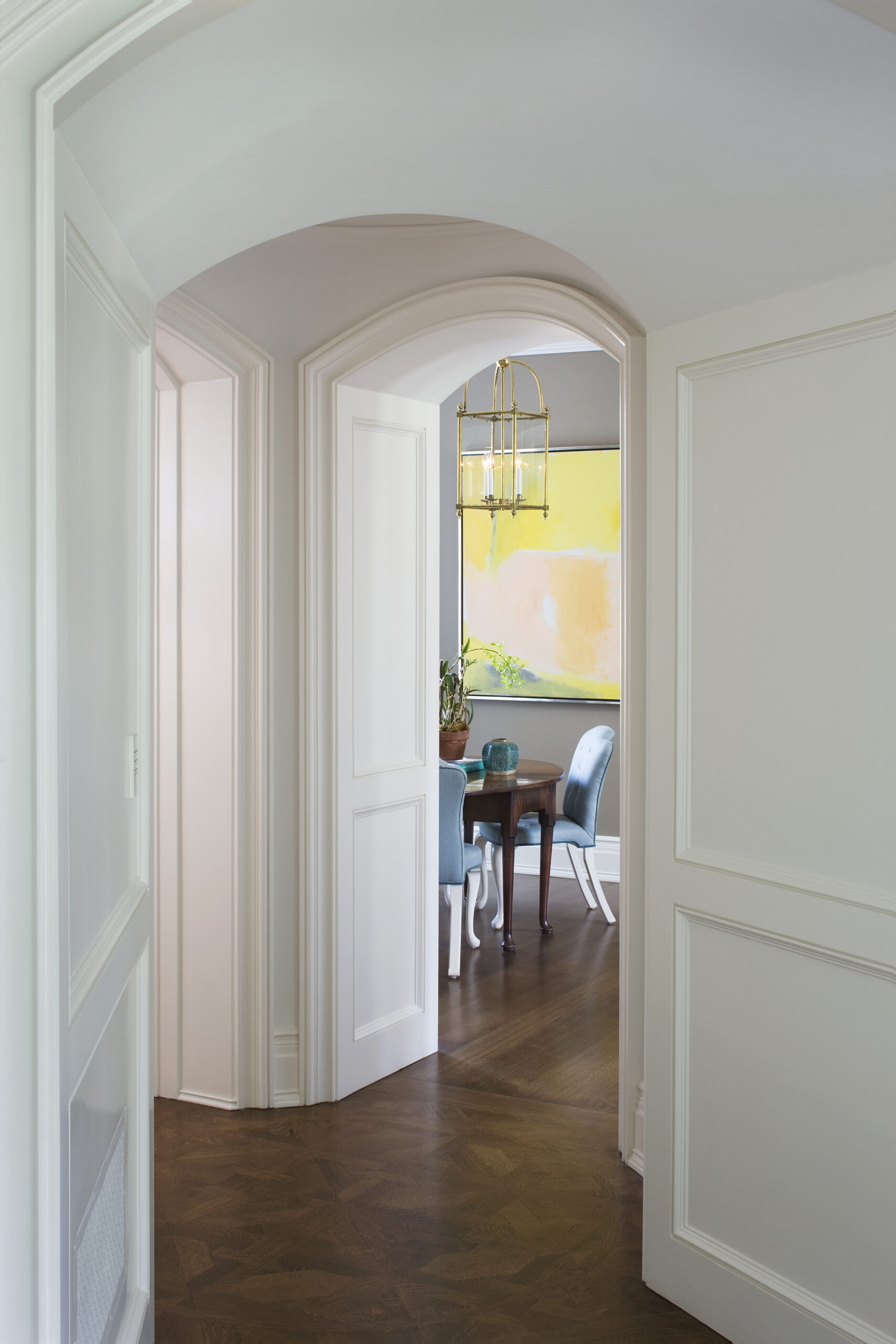
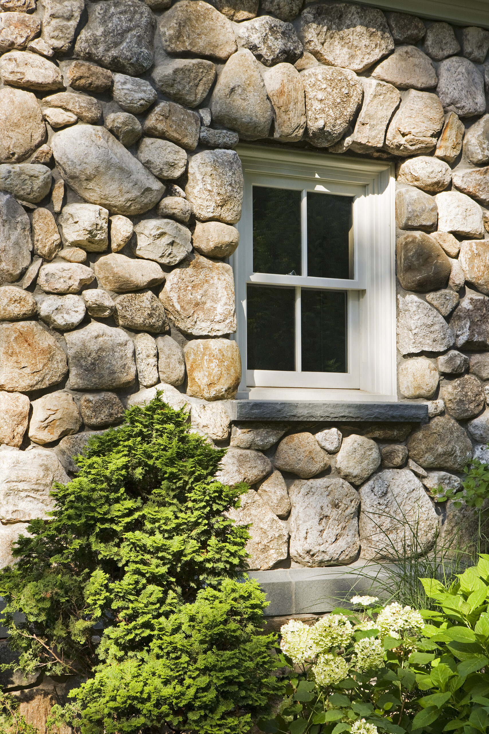
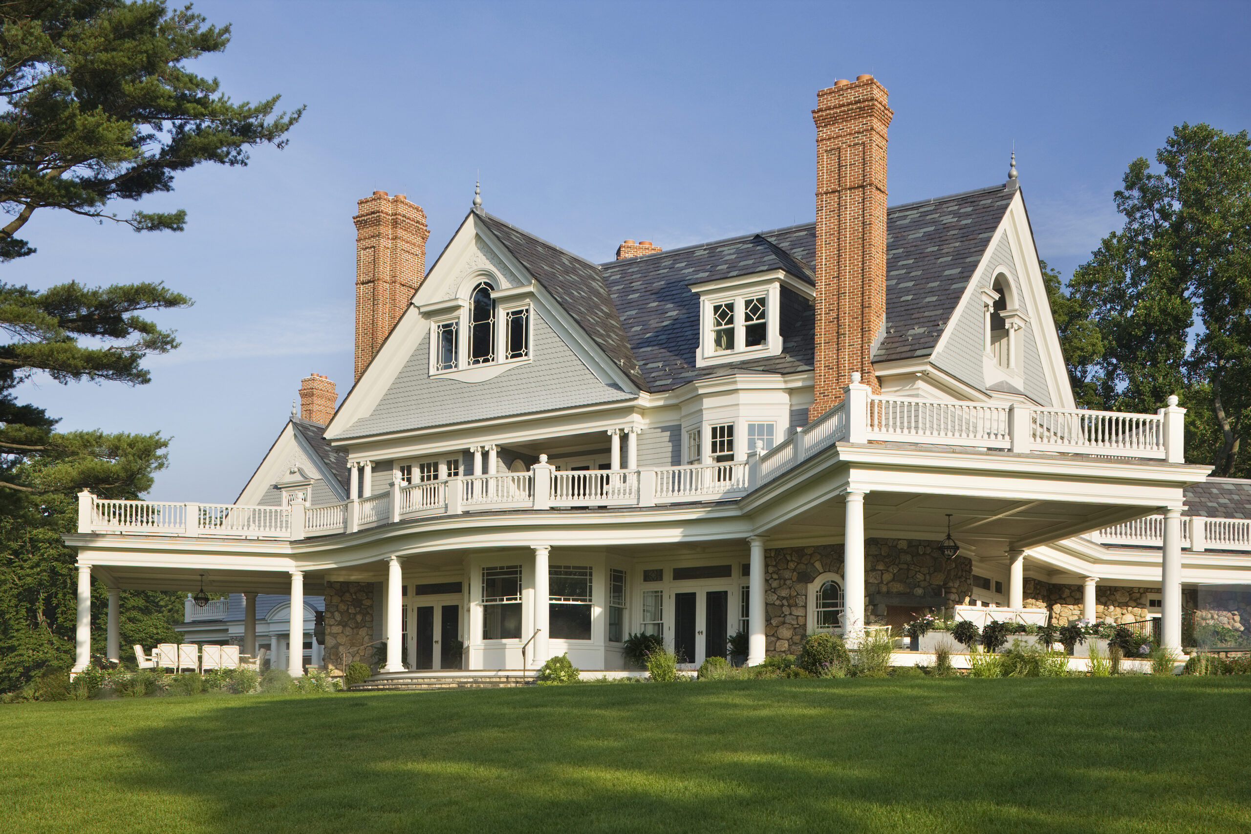
The transitions between the various wings create lovely moments of surprise, such as circular vestibules, one leading into a powder room off the front hall and another into a small study upstairs off the master suite. Niches are carved into the poche—or solid wall sections in the plan—of the octagonally shaped dining room. But, despite the many angles, Wadia designed each wing of the house symmetrically so that they could unfurl from different viewpoints and be experienced as vignettes. The southeast façade of the living room comprises a gable with a center pedimented arch, relief panel, and Mannerist window surround at the attic level; a North-east facing gable is anchored by the dressing room bay of the master suite and third-floor office balcony. The Queen Anne flourishes—the stone entry porch, circular tower, different shingle textures, and fieldstone base—overlay these moments with a layer of whimsy and the anticipation of the unexpected.

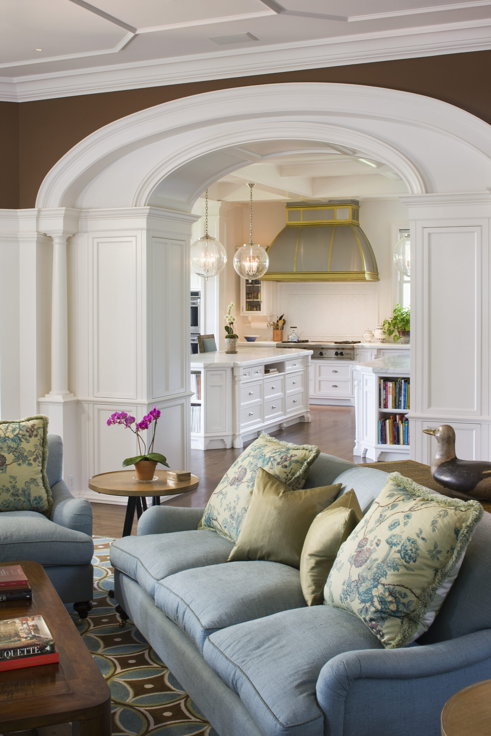
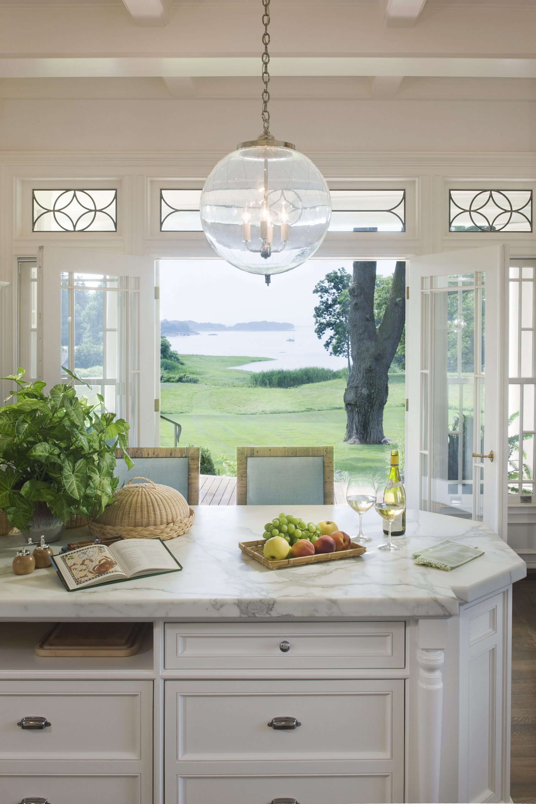
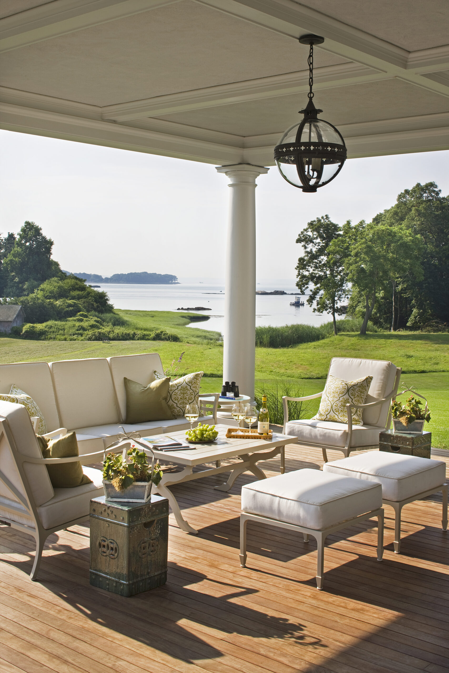
The house culminates in the southwest-facing back porch with sight lines that funnel down to the Sound. Its virtue is two-fold. Due to its unique shape—like a child running with its arms outstretched toward the water—it opens up completely and has a broad expansive view. However, from the inside, the porch is completely hidden; the south dining porch and east sitting porch hang off the corners of the house where there are no windows so as to not diminish the amount of light flooding the interior or block the view from the family room or kitchen. A walkway—or curve that bends around the breakfast room bay—connects the two areas of the porch, at the same time providing extra cover for the basement squash court, which was added to the design brief at the last minute.
